白雲間
Cloud with Cream
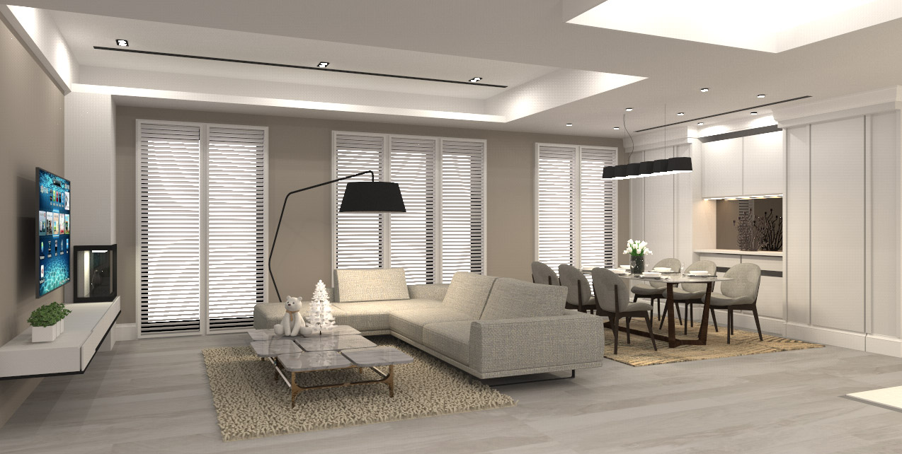
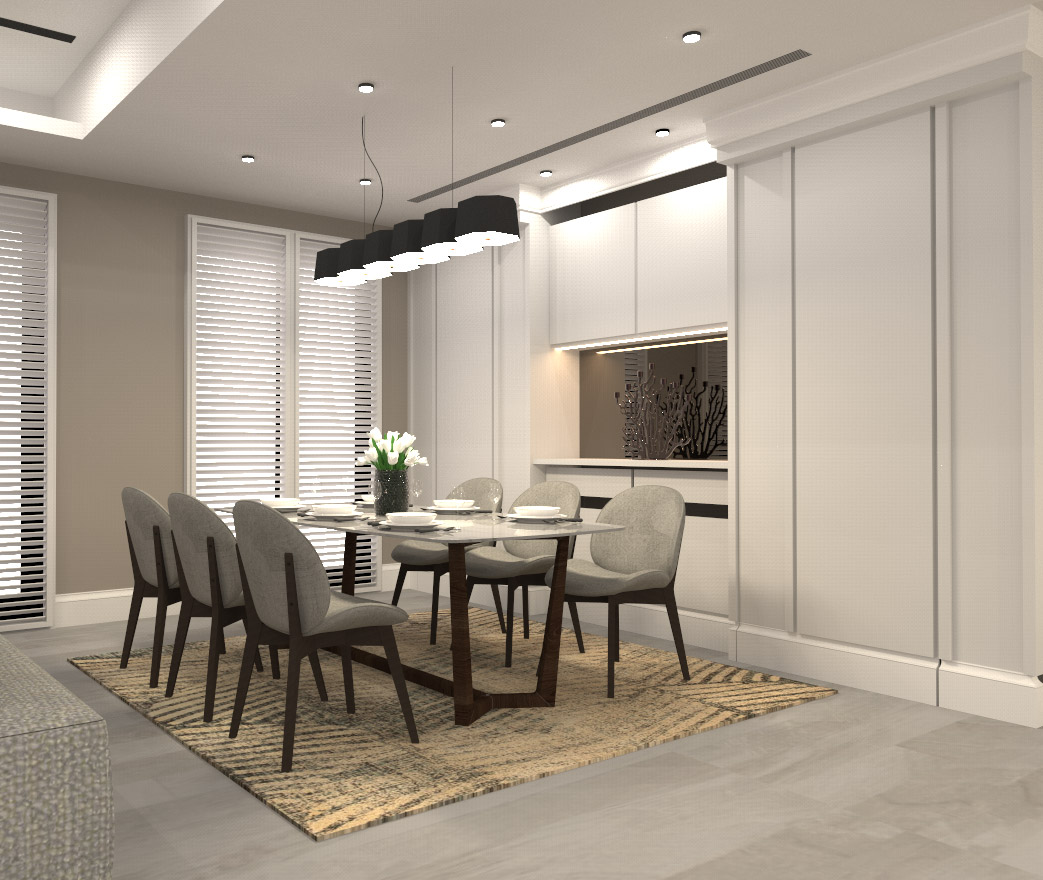
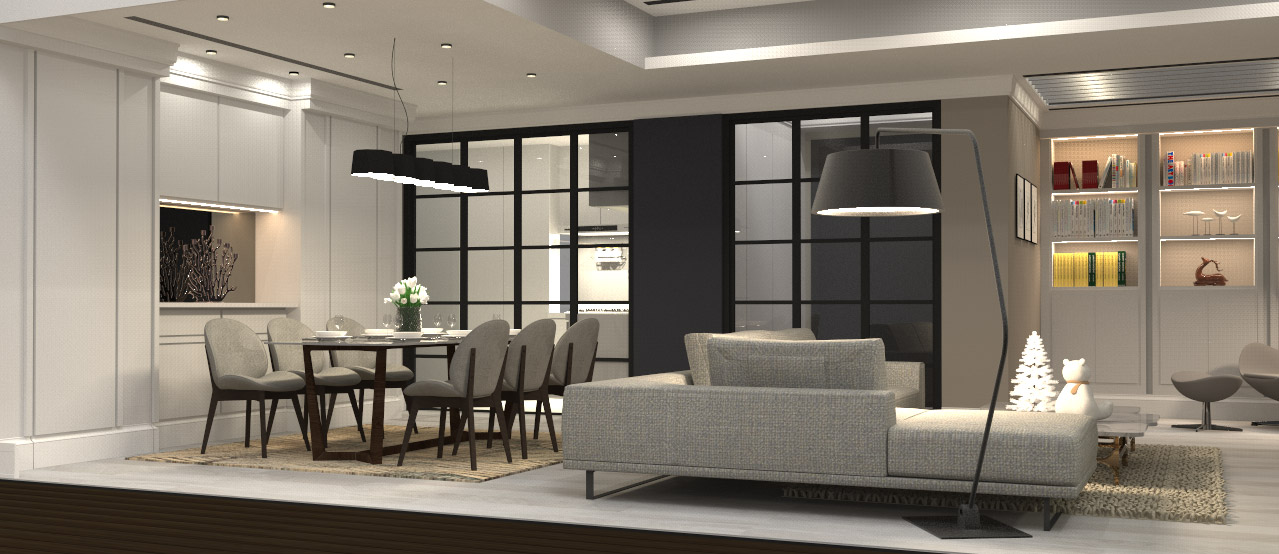
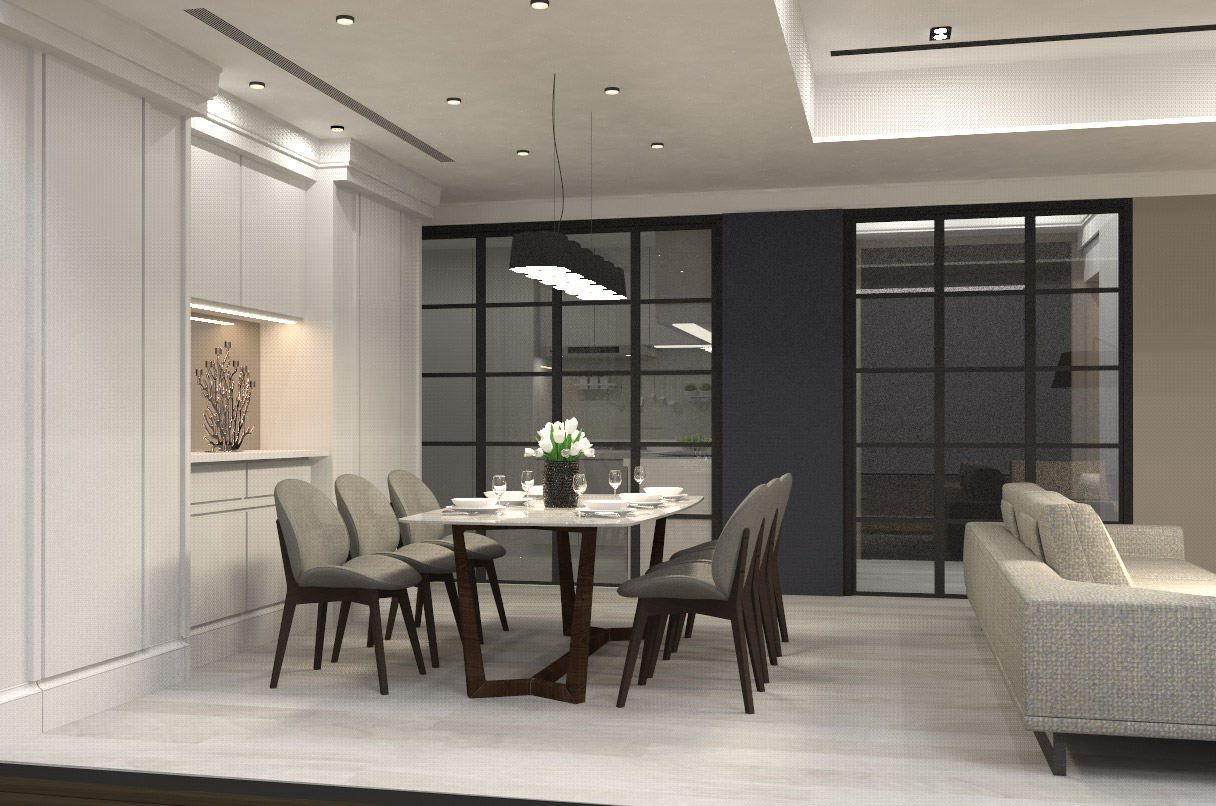
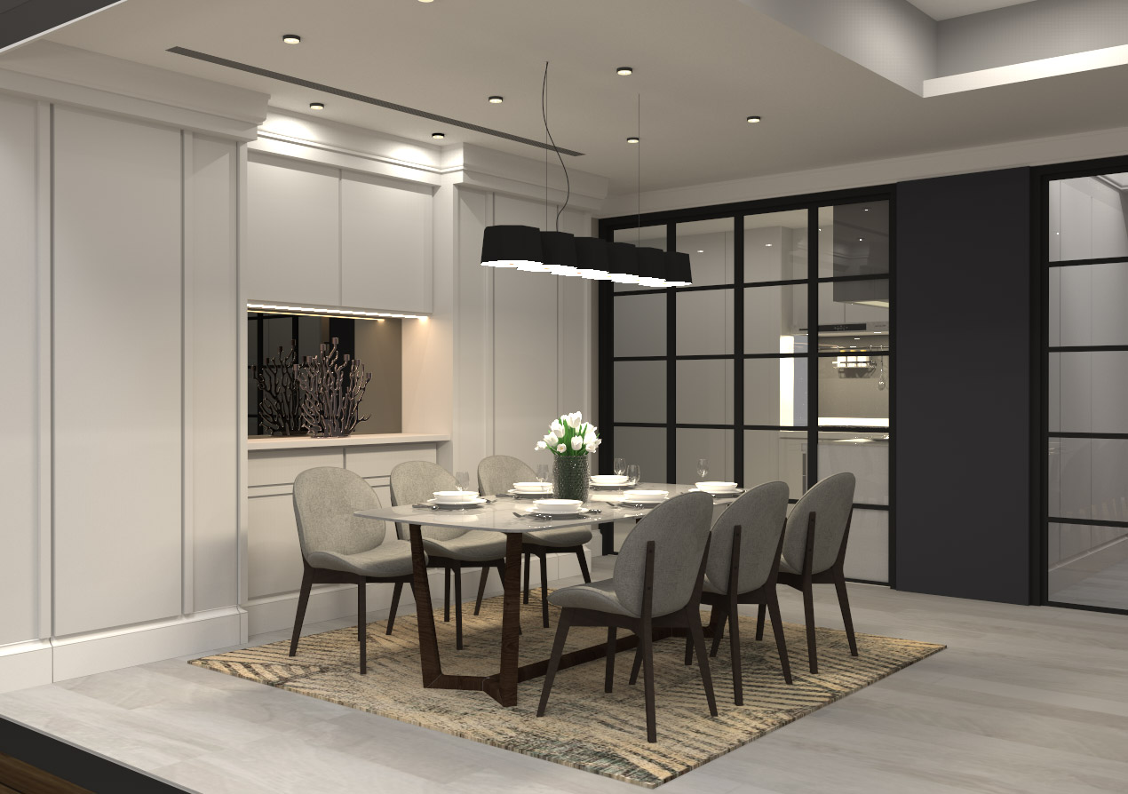
The transparent field is not divided into spaces, and only the smooth lines and furniture are used to distinguish the simple field. The living room, reading area, dining room, and kitchen are next to each other. It is more convenient for family members to share together in the lounge and dining room. The woody tone with high spatial consistency is consistent with visual coordination. The cabinet is planned with a simple and clean white baked lacquered surface, which visually and cleanly divides the function lines to enhance the refreshing and bright texture.
通透場域無間隔區分,僅以流 暢動線與家具配搭畫分出簡約領域樣 貌。客廳、閱讀區與餐廳、廚房彼鄰,家人間更方便共 享共聚於休憩與餐食間。挑高的空間一致性的木作韻調,連貫出視覺 協調度。以簡約乾淨的白烤漆面規劃櫃體, 視覺乾淨劃分出功能動線,提升清爽明 亮質地。


