聽弦
Chord
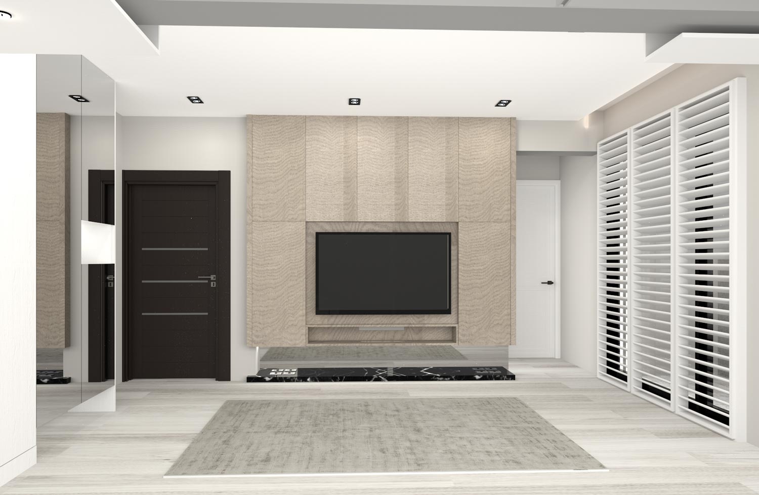


The most important feature of this project is that the demonstration of interior visual balance can be seen between of the bright light and the arrangement of dark mate- rials. The main door and the design style of the entry area all made of dark mate- rials can compare with the bright feeling of the living room; that is the spatial meta- phor which can demonstrate the graceful interior scenes with clean and brisk sens- es. The main style of the floor is made of white lumber which is a moderate way to compare with other furniture. The double French windows with the silky drapes can screen the outside view and make the in- terior brighter at the same time, which is the design strategy to reveal sort of aes- thetics of modern minimalism.
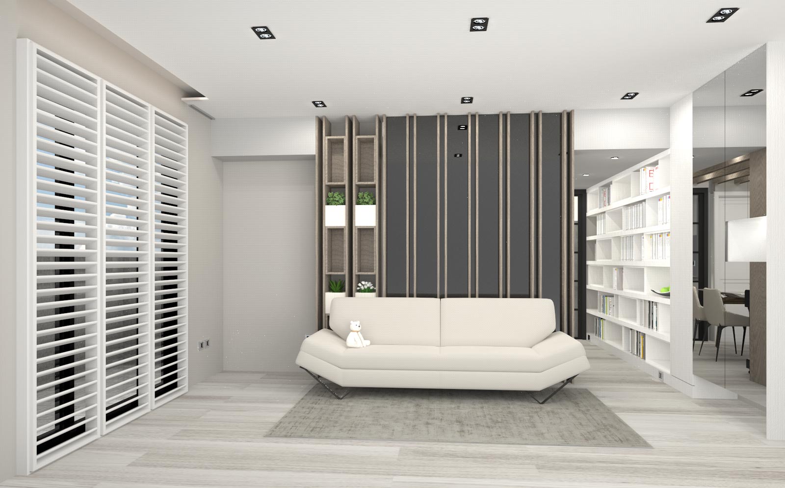
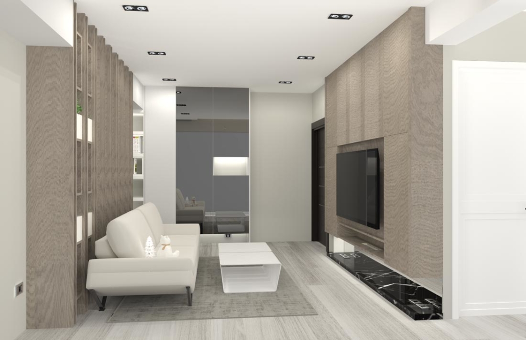
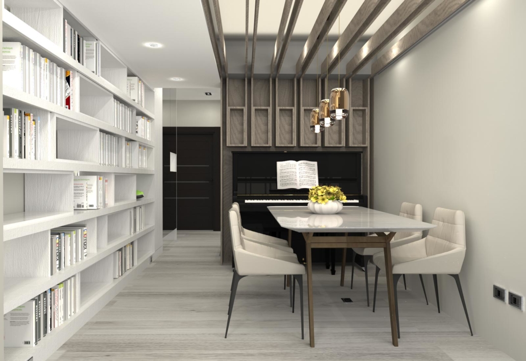
There are no exact separations in the pub- lic area; all the sub-areas are defined by the arrangement of furniture and smooth traf- fic flow. The family can enjoy their leisure and dining time in between of the living and dining rooms, since these two rooms are connected smoothly. The wooden material applied to the main TV wall and the cabinets can balance the interior vi- sual sight. The kitchen island connects the cooking area and dining area with the background of white cabinets, which can enhance the bright atmosphere with clean
spatial visual effect and simple traffic flow.
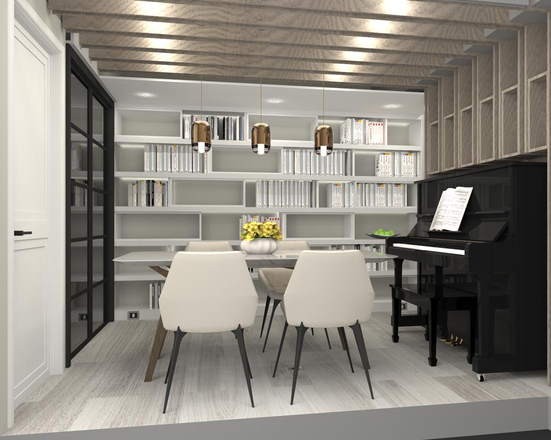
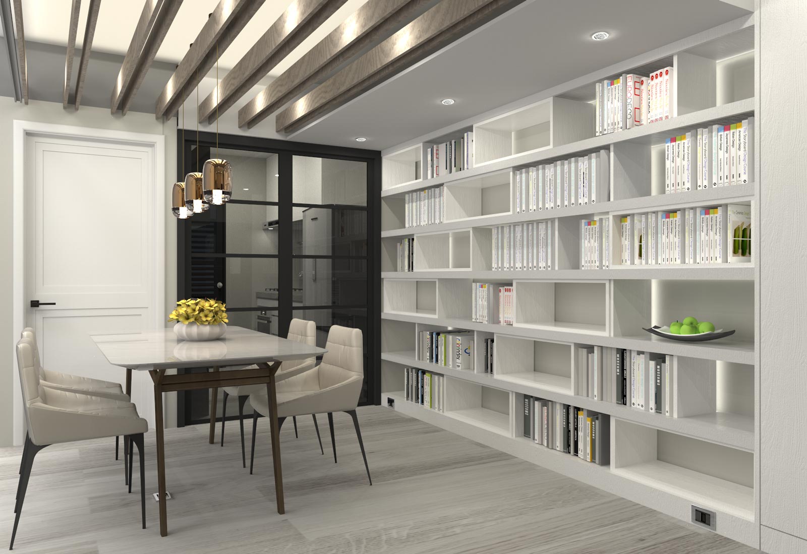
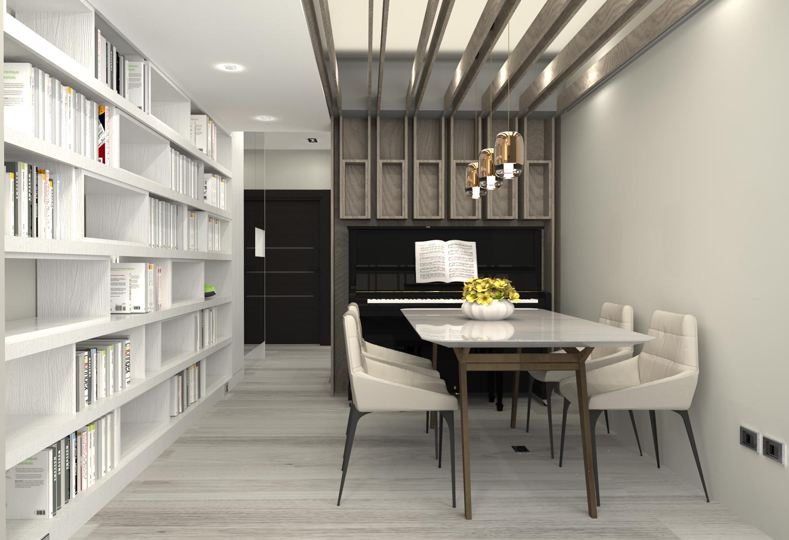
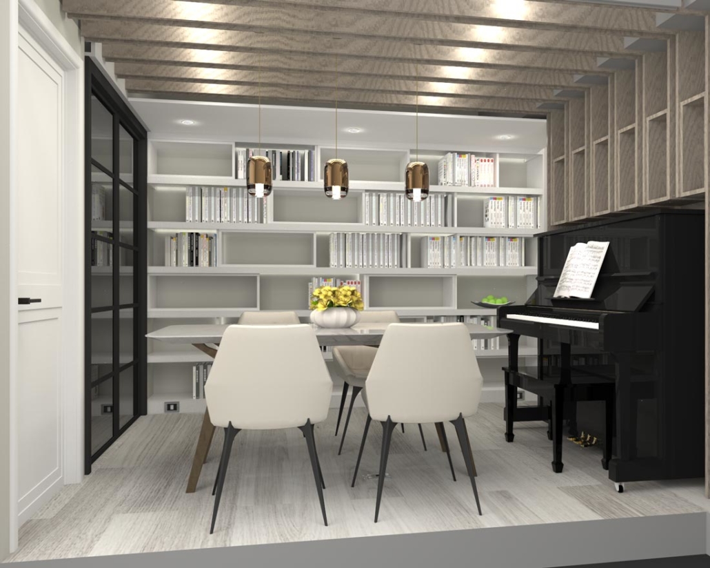
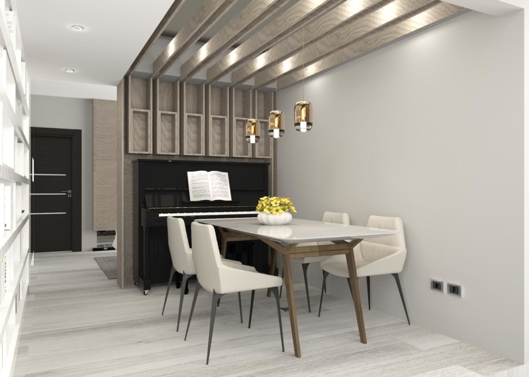
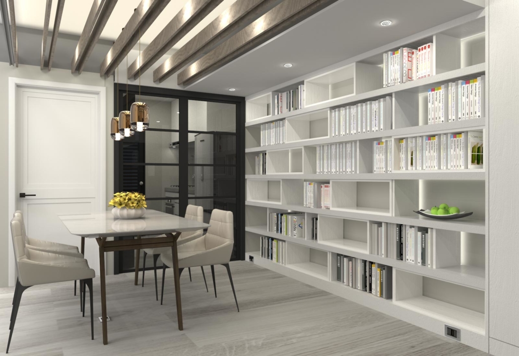
The entry area and the dining area are merely divided by wooden cabinets, which is the moderate way to create clean and easy spatial separation. The cabinets in the entry and dining areas are decorated by the same wooden material, and com- posed by L shapes to show the compre- hensive design intention. In the dining area, the left side of the cabinet composed with interesting slabs arrangement is the best places to demonstrate the owner’s collections of classic wines. The right side of the cabinet which has the regular slabs arrangement and embedded lights can set delicate glass and porcelain artifacts in or- der to display the elaborate spirt. The din- ing table made of white marble compared with the same texture of white and shiny kitchen island can generate the peaceful atmosphere; these two white objects can generate the visually contrasting effect by the comparison of the wooden cabinets.
The back area of the living room is the reading area which is divided by the black metal frames with glasses. These frames are the best solution to retain the interior vision and cut off the noise when the own- er wants to enjoy personal reading time freely. In the reading room, there is a desk directly set in front of the window. There- fore, sunlight can light up the reading area efficiently. In the master bedroom, the same minimalist style can been seen in which the gray wall divides the whole space into two areas- one is the bed area, and the other one is the dressing area; the intention of united style has been dis- played naturally.
在沉穩與明亮間,平衡視覺力度。大門 與玄關的沉,對比出客廳的亮,隱喻出 景觀視野的通透與採光優越。地面滿鋪 低彩洗白木色,中和風格樣貌更易配 搭。雙層落地簾幕拉起紗面將視覺淡化 並保留乾淨光質,呈現代簡約妝室之 容。
公領域採通透場域無間隔區分,僅以流 暢動線與家具配搭畫分出簡約領域樣 貌。客廳與餐廳彼鄰,家人間更方便共 享共聚於休憩與餐食間。電視主牆面與 餐櫃為一致性的木質韻調,連貫出視覺 協調度。輕食中島連結廚房料理區域, 以簡約乾淨的白烤漆面規劃雙區櫃體, 視覺乾淨劃分出功能動線,提升清爽明 亮質地。
玄關與餐櫃區僅以木作收納區隔,視覺 輕鬆劃分區界,玄關櫃體與餐櫃同系胡 桃木色以L型整面展現。上櫃左有菱格 木作隔層,方便橫置承放屋主酒藏,饒 富趣味俐落。右有方格木作隔層內坎燈 源,可供置裝飾品與餐瓷玻璃等,更襯 托其精緻度。餐桌面為卡拉拉白大理 石,與中島廚區白色晶亮一致氛圍,並 與深系餐櫃對比出明暗質韻。
客廳後方為書房區域,以黑框架坎透玻 為牆,模糊分界並通透視感又能阻隔音 源,方便屋主安靜閱讀的習性。書房內 直接於窗前木作桌面,將窗邊優質採光 重點保留於書桌區辦公用途。主臥中僅 以床頭主牆分界後方更衣梳妝區域,一 派的簡約俐落。

