光合
Luster Collect
The details are placed in the most important position, with the design ingenuity of turning the zeros into the whole, to drive out any possible abnormal zero areas, and to build an open and open view of the home. In addition, the homeowner’s screen is more careful to remove messy daily trivial things, presenting a dry and clean living atmosphere, and tailor-made refreshing wooden furniture for the whole house, as well as a warm and bright lighting plan to welcome the rising sun every day and let the warmth melt. The scenes of life spread out and took off.
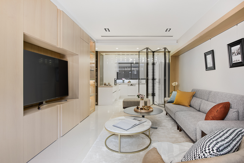
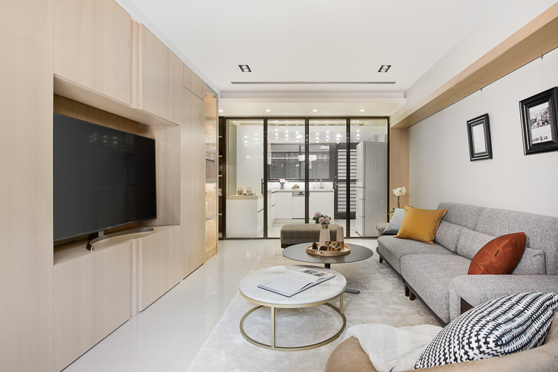
The height difference of the ceiling plays the role of invisibly dividing the dining area. At the same time, it points out the movement to the reading area. Sliding rail belt with folding doors in the dining area to unify the three functions!
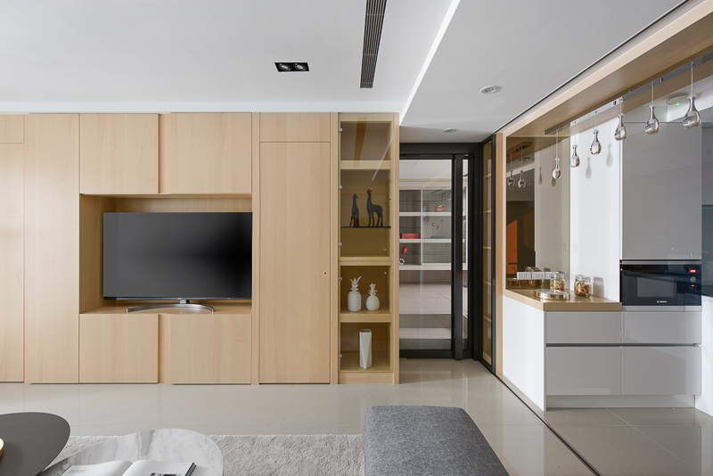
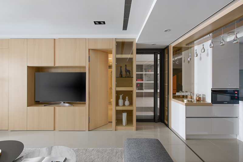
Returned home, the open and transparent comfort to heart, and the natural light that jumped in through the floor-to-ceiling windows instantly released the narrow imagination of the closed barriers between the areas. The field is composed of different materials with simple lines, and pure white and light brown are selected to extend the light and soft pace of life. Among them, the TV wall is constructed of wood. The doors and gaps are specially designed and concise. It contains ample storage cabinets. The sides are used as display areas. The wood is sprinkled under soft lights. The vibe with the artwork escapes in the room through the clear glass. The living area defined by the short-pile carpet, the warm gray sofa and the black-plated round table stand out from the base color, highlight the functional focus of the area. The visually lightweight hanging wall cabinets are used as shoe cabinets to store the space. The space is reserved to avoid the feeling of oppression.
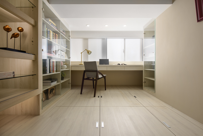
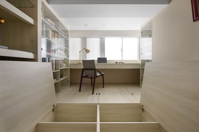
In order to accommodate storage, the study room has a raised floor as a storage space. The ceiling is also equipped with a warm light source to cut off the sharp corners and low pressure of the beam. In order to meet the demand of homeowners for a large number of books, the façade includes the hearty temperament of woodwork and clear glass, and plans to set up various types of storage spaces. With the concept of flexible use as the core, the bookcase is customized to facilitate the adjustment of the height of the floor . In addition, the raised floor can be described as a hidden mystery-after lifting the floor, you will find a huge storage area hidden under the ground, suitable for storing board games, Lego, etc. and various collections, alleviating the user’s trouble of having no disposal, and making people It is like riding on a treasure to read at the desk, forming an interesting thought situation.
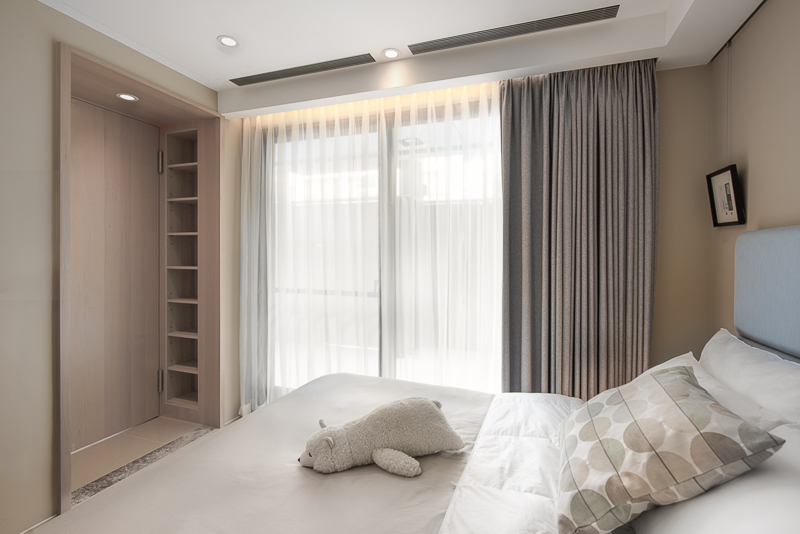
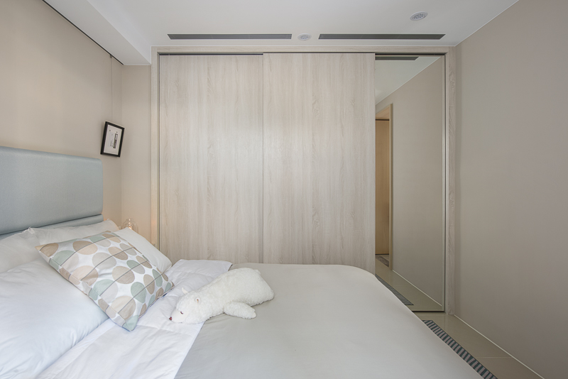
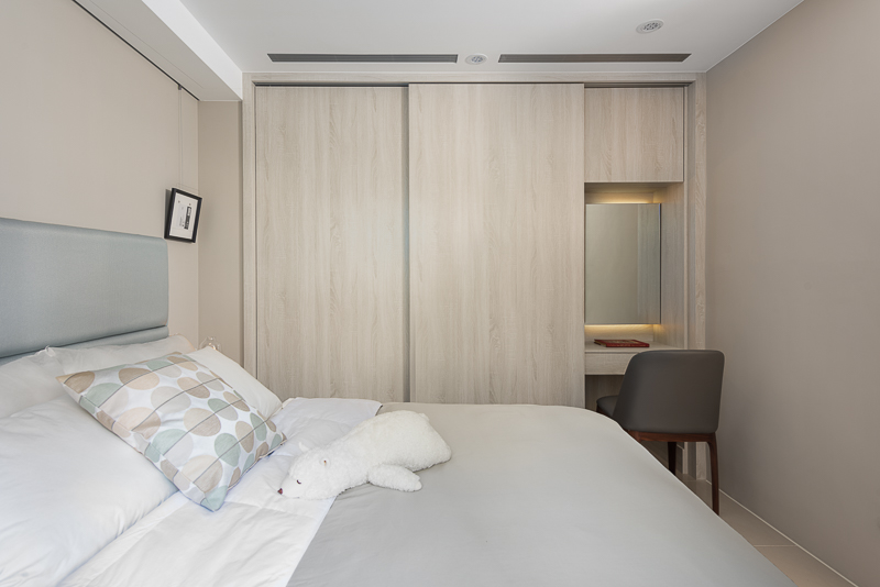
The entrance of the master bedroom echoes the back wall of the living room area. The wooden frame is used to build a clear scene transition image, and the cabinet is integrally formed to provide users with easy storage of things. Across the entrance door frame and formally enter the bedroom, the wall paint, wood and bedding together reveal a gentle background. The bedside stretcher and floor-to-ceiling curtains are in light blue, both of them are like a soft cool quilt in the summer afternoon, laying out a soft world suitable for sleep. In a small space, closely placed sliding-door wardrobes and built-in countertops to integrate the daily fixtures and decorations on the same plane, neatly in a limited field.
When all the details are in place, a beautiful life will naturally appear. The pursuit of delicacy and perfection is the designer’s bounden duty. Here, we can effectively integrate the simple beauty and powerful storage function, and in the pure color base, the space lines can be flexibly changed, so that the home scene can be shaped as the user’s gestures and gestures. The unique appearance is like being ready to hold a beautiful space container, just waiting for the corresponding life to happen at any time.
細節放在最重要的位置,以化零為整的設計巧思,驅除任何可能的畸零地帶,構建敞朗開放的家居視野。此外更細心替屋主屏除雜亂的日常瑣物,呈現出乾爽潔淨的生活氛圍,並為全屋量身定製清爽木質家具,以及溫暖明亮的燈光規劃,迎接每日升起的朝陽,讓暖融融的生活場景就此展翼起飛。
天花板的高低段差發揮隱形分割客餐區的作用,同時指出前往書房的動線,更裝設了餐區折疊門片的滑軌帶,將三種功能合一展現!
回到家,開敞通透的舒適感迎上心頭,透過落地窗躍入的自然採光,瞬時抒開區域間封閉隔閡的窄仄想像。場域由線條簡約的異材質構成,選用純白及淺棕色系,延展出輕快柔和的生活步調。其中電視牆採用木質建構,經仔細測量的門片與間隙,是特別規劃的簡潔樣式,含藏了餘裕十足的收納暗櫃,搭配邊側設為展示區塊,於柔和燈灑下,將木頭與藝品的氣韻透過清玻逸散於居室。短絨地毯界定出的起居區塊,特立於基底色彩的暖灰沙發與鍍黑圓桌,凸顯出區域的機能重點。視覺輕巧的懸空壁櫃,供作為鞋櫃儲物之用,保留空處,避免壓迫感受,形塑闔家圍坐談天、觀覽影視的清朗空地。
書房為因應收納,而加高地板,做為儲物空間。天花板也加裝暖色燈源,削去樑體的尖銳折角與低迫感。而為滿足屋主大量藏書需求,立面延攬木作與清玻的爽朗氣質,規劃設出各式的存書空間,並以彈性運用的概念為核心,書櫃客製出便於調整層高之架構。此外,加高的地坪可謂暗藏玄機——掀起地板後會發現隱藏地底下的巨幅儲藏區域,適於存放桌遊、樂高等及各種藏品,一舉消解使用者無處置物的困擾,使人宛如乘坐於寶物之上伏案閱讀,形塑一幅饒富趣味的思想情境。
主臥房入口呼應起居室區域背牆,採用木作邊框搭起明確的場景轉換意象,一體成型地搭載立櫃,提供使用者隨手收納什物。跨越入口門框,正式進入臥房後,牆漆、木質與床品共同流露出輕柔底蘊。床頭繃板與落地窗簾採用淡藍色,兩者如同夏日午後的柔軟涼被,鋪敘一片適於睡眠的鬆軟天地。而在如此小巧空間中,設計師亦緊密地置入滑門衣櫃,以及內嵌式梳化台面,將每日所需的治裝打理整合於同一平面,俐落地於有限場域中完備多項機能。
當一切細節都到位時,美好的生活樣貌自然就會出現。追求細膩與完美,正是設計師的天職,在這裡有效整合簡潔美感與強大收納功能,並在純淨的色調基底中,靈活變化空間線條,使住家場景隨著使用者的舉手投足,形塑為最獨特的模樣,猶如準備好承裝美好的空間容器,只待相應的生活裡隨時發生。


